Plant Doctor
Product design of a B2C Mobile app for amateur gardeners

Many unskilled plant growers struggle to keep their plants alive. When a plant has a problem, the plant owners look for solutions, but occasionally they forget the name of the plant and receive confusing information from social media.
A B2C app that helps plant growers diagnose and treat their plants' problems.
Research goals:
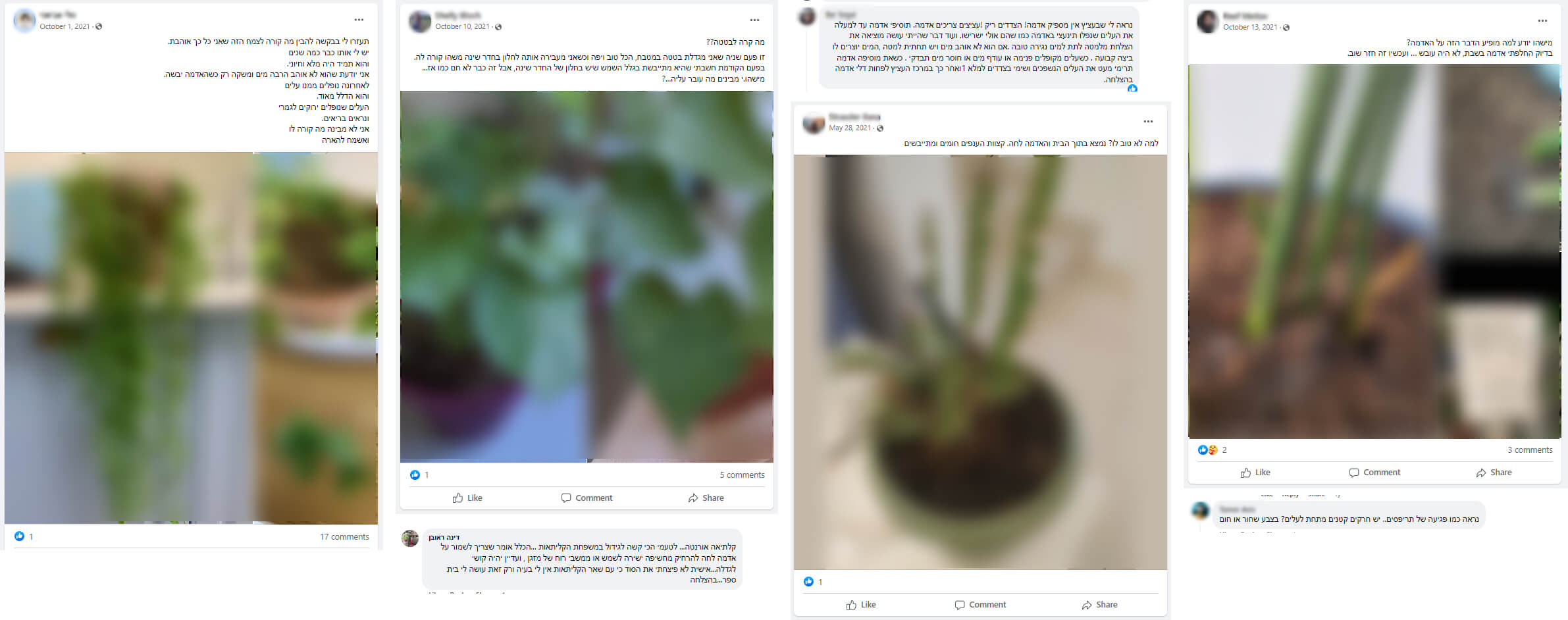
Method: In order to understand how people seek guidance when they have issues with their plants, I joined several Facebook groups. I selected the groups based on their size and daily posting rates.
Conclusions:
Most posts have a similar structure:
The answers also had a similar structure:
This research helped me define the product's audience and choose my user research participants. It also helped me define the voice and tone of the product.
Research questions:
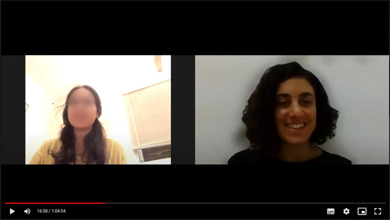
Participants: 6 participants (1 male and 5 females), aged 28 to 46. All participants grow plants at their home.
Method: One-on-one interviews via video call. Each interview lasted about an hour. I recorded the calls so I could go back over the details later.
Preparations: Before the interviews, I made a list of questions about the participants' personal life, daily habits, technology use habits, and about their experiences with growing plants.
Main conclusions:
Based on the user interviews, I created one main persona for my product.

Research goal: Learn how other products help users to solve problems of their plants.
Method: I tested 3 main products: Plantix, NatureID and Planta. I chose those products by their Google Play rank, the number of downloads and the similarity to my product.
Main conclusions:

I made a detailed user flow for the primary task.

Based on the user flow, I created multiple low fidelity wireframes for the main user flow.
I started with simple stketches, and then added more details.
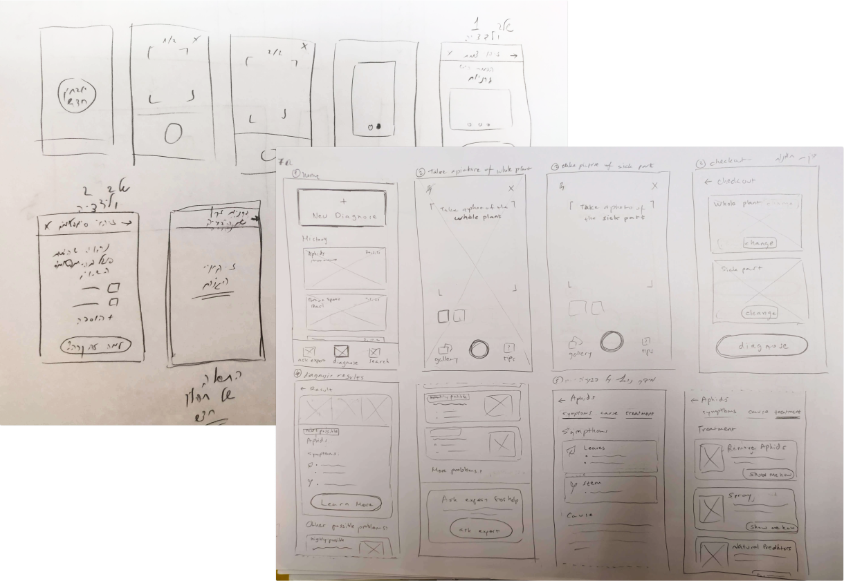
I used Figma to create high fidelity wireframes of the main flow.
I also created wireframes for secondary flows like chat with a professional and adding a new plant to "My Plants" list.

Goal: Test if user understand the main flow and the secondary flows of the product.
Participants: 4 participants, 3 of them participated in the user interviews.
Method: I executed the user tests in a face-to-face meeting with each participant separately.
Preparations: I used Figma to create a simple prototype of the main flow, and tested it on a mobile phone using Figma Mirror. Before the meeting I wrote down a list of tasks the participant should do during the test.
Conclusions:
Following the user testings, I changed some of the wireframes, including the onboarding process and "Search plant" screen.
%2520(1).jpeg)

Users didn't understand the screen's purpose. They assumed it was the camera screen and tried to take a photo of the plant.

I added a "start test" button in all of the onboarding steps, and changed the microcopy. Sliding the screen allows you to move between onboarding steps.

The history screen was similar to the test results screen. When users returned to previous tests, they expected to go straight to the solution.

I made a new view for the history. Users can view a summary of the test results at the top of the screen.
Based on the wireframes, I created mockups for the app's screens: main flow, secondary flow, home page and onboarding process.
The app is intended for amateur users. Therefore I wanted to add some mischief to my design. This principle guided me in choosing the colors, typography and graphic elements (icons, illutrations and images).
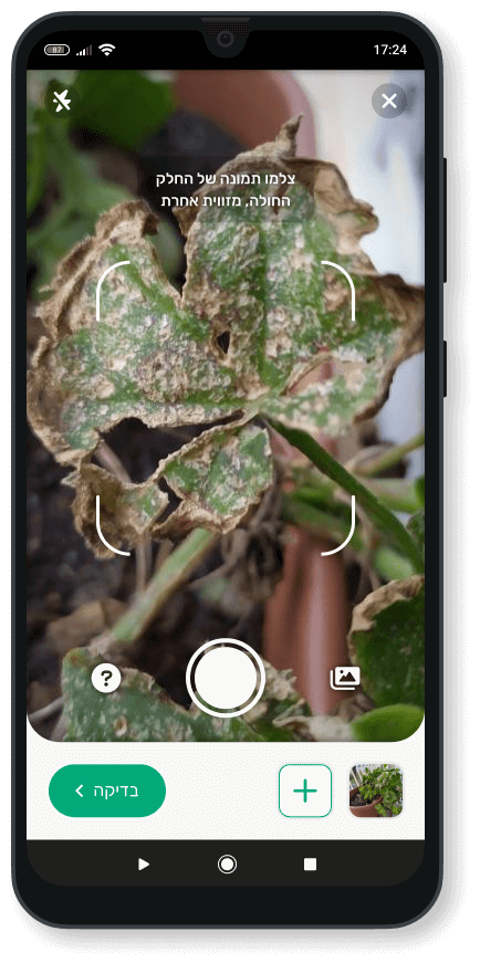
The user can take up to 3 photos of the plant.

The user can watch photos of the plant to make sure that the app recognized the right plant.
I added this step to increase the user trust.
.png)
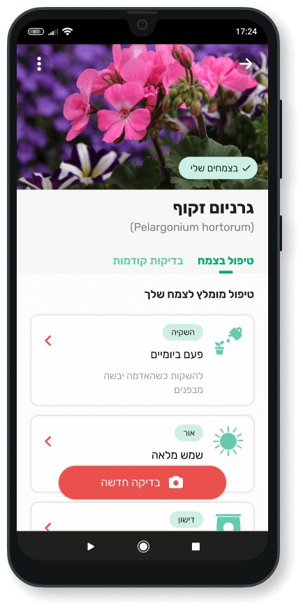
The app shows what happened and why.
The user can look for other possible problems by opening a drawer.

Mostly there is more than just one solution for each problem. The user can see which solutions might solve the problem.
.png)
The user can watch a tutorial to learn how to solve the problem. There is also an option to save tutorial for later.
Following the user testings, I added a primary button which allows the user to start the primary flow in each step of the onboarding.
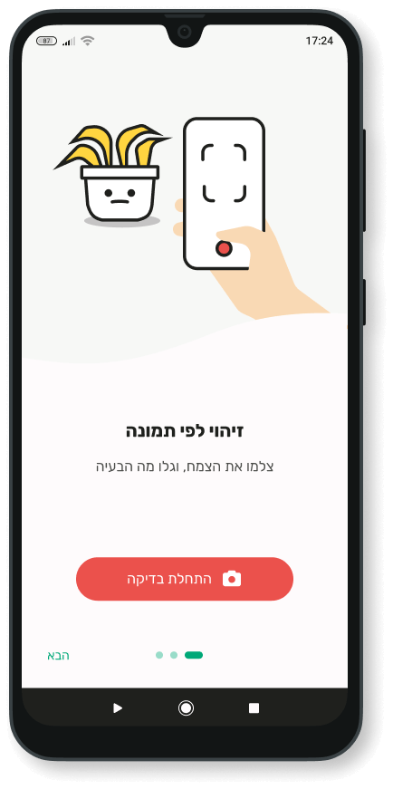
Recognize plants and problems by image
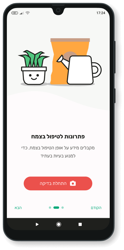
Get solutions
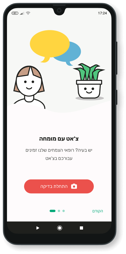
Get help from an expert
Users can open "My plants" list from the home page. They can see information about their plant, view history of the plant's problems and add a new plant to "My plants" list.
.png)

I used Rubik for all the texts in the product. I chose this font for various reasons:
I chose two main colors for the app:
I chose colors with high saturation levels, to make the app feel more lively and friendly.

One of my research conclusions was that many people treat their palnts like a baby or a pet. I wanted to add some personification to the plants in my product.
To do this, I added illustrations for each problem description.

.png)
.png)

